Friday, April 29, 2011

Theresa Cifali and This Artist's View Make a Move!


Dear Friends,

I am so very excited to announce that


has moved to a new platform!

While the diggs are new...the content is still just as stellar as always.  Please come visit and bookmark the new spot.  I'll be looking for you!

Artfully yours...Theresa

Thursday, April 21, 2011

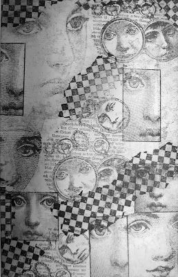
Making Your Own Background Paper Part 1: Using Rubber Stamps


Have you ever driven yourself near mad just trying to find the absolute right piece of patterned paper to go with your scrapbook layouts or handmade cards?  Let me share a secret with you....I am having a love affair with paper...especially patterned paper and handmade paper.  Believe me, I have A LOT of it!  However, from time to time I just can't find exactly what it is that I want in my stash nor do I have the time to run out and look for something at my local store.  So, out of the love of craftiness, I have started making my own papers to coordinate with whatever I am working on.  (yes, I have a HUGE stamp pad collection, too!)

The sample above is a piece of background paper I made using a few simple supplies.  You will need:
  • White or a fairly light colored piece of card stock or scrapbook paper
  • Permanent Ink (I like to use StazOn by Tsukineko)
  • Dye based ink (I like to use Tim Holtz's Distress Inks)
  • Stipple brushes
  • An assortment of rubber stamps


The first thing you will want to do is take your largest images and begin to stamp those randomly onto your solid colored piece of paper.  To make it interesting, stamp some of the images off the page.

**Something important to note....when using this technique, you want to make sure you are using PERMANENT ink.  If you try to use dye inks to stamp your background, they will smudge when you go to colorize it later.

Start with your largest stamps.

Next, stamp your medium and smaller stamps to fill in some of the white space.  Again, use a random pattern and stamp some of the images so they are "hanging" off the page.  Also, overlap your stamps.  It looks really cool!

Add your medium, then small stamps.
Next, use a filler stamp, like the checkered patterned stamp I used below, to fill in some of the wider areas of white space.  Overlapping images looks really cool, so don't be afraid of it.  Once you've done that, it should look something like this:

The checkered image here fills in some of the white space.
I think that looks pretty good, but there is still too much stark white space.  To deal with that, I used this textured stamp and stamped it all over the areas where there were white gaps.  This creates texture and makes the over all look much softer.

Create texture by randomly stamping this type of image over stark white areas of your paper.
If you don't have a textured stamp in your arsenal, that is just fine!  You can create texture in other ways.  You can "stamp" with the following:
  • a stipple brush and tap the bristles onto the paper 
  • a crumpled piece of wax paper or even tin foil
  • a piece of steel wool 
  • the scrubby side of a sponge
  • a sea sponge (which will be right by the sea shells in your local craft store) 

Once you have added the texture, your paper will look like this.  


I think this is really pretty.  In some circumstances I would leave it just like this, however, this paper was going to be used in a vintage style layout, so I added some color using Tim Holtz's Distressed Inks.  

Using my stipple brushes (ya know I can't help myself!), I stippled the lightest color first using a sweeping motion.  Then I highlighted specific areas with the middle color. Finally, I used the darkest color just at the edges of the paper for some contrast.

When I was done, it looked just like this:


I hope you are inspired to make some of your own background paper.  I have been doing this a lot lately and have more ideas to share.  So check back for part 2 very soon!

Just a heads up to you...soon I will be moving this blog to another space along with a new URL.  I will keep you posted.  I hope you will join me there.  I'm very excited about it.

Artfully yours....
Theresa

Thursday, April 14, 2011

Eggspecially Eastery Layout


Happy Easter everyone!  Sorry to keep this short today, but I wanted to make sure that I had my post up for the Designer Crafts Connection Blog Hop!  Yep...that's right, we are hopping today.  Make sure you check out Julie McGuffe's blog for the details regarding the giveaway this month!

Before I get completely into this post....I want to say thank you to all of those who keep coming back and checking with us.  We are a new group here at Designer Crafts and are working out some of our posting glitches and such.  One item of business that we have worked out is when we are posting.  Keep in mind, that you can hop through all our blogs any day you choose.  Our official hop days (the days an event will be going on) will be on the first Monday of each month.  Make sure you come back on those days...watch for reminders....as those will also be our giveaway days!  I'm so excited.

My project today is a very simple Easter layout.  My favorite parts of this layout are the Easter egg paper and the Jolee stickers.  They aren't from the same manufacturer, but they coordinate so well.  Ah, kismet....I love when that happens!

Don't forget..today is hop day...so hop forward or backwards!  Enjoy!!

Artfully yours,
Theresa

Sunday, March 13, 2011

Digital Sign in Book


Welcome to Designer Crafts Blog Connection hop day!  Today we are all going to be showcasing Wedding themed projects!  We will also be announcing the winner of the Cricut Expression.

My project for today is a Digital Sign In Book that I made a while back using a program called Heritage Makers.  Did you ever go to a wedding and see those giant poster size pictures of the bride and groom where you can sign the frame matting it?  I often wonder how many of those actually make it into a frame and onto the wall of a new couple's home.  Probably not that many.  My solution is to make Digital Sign In Books using pictures of the happy couple.  Using this program I can completely customize the pages and manipulate the photos.  I can add text to the pages if I choose....for example, one couple gave me lyric quotes from some of their favorite songs.  The point is to leave lots of "white space".  Once I have the pages laid out just right, I can have them printed in a 21-page, hard covered book.  The couple then can send it around to all the tables at the wedding for their guests to sign.  It makes a wonderful keepsake and it is a bit more manageable than those giant posters.  

Here are a few samples of pages from inside the book.  Enjoy!  Oh...and don't forget...our next hope date is 4/4! 


Artfully yours,
Theresa

Tuesday, March 8, 2011

Recycled Floral Decor


For as long as I can remember I have been very attracted to tins that are unusual sizes and shapes.  I have hoarded and stockpiled them always with the intention of doing something "really cool" with them.  So, during the holidays when I was out at the liquor store buying what I like to call "happy gifts", this tin of Jameson Irish Whisky caught my attention.  I just had to have it....and I don't even drink whisky!  So, I gifted the bottle and kept the tin just for me!  Is that wrong?  lol


Ok...yes, it's March.  I just wasn't quite sure what it was that I was going to make this into at first...but finally, when I saw the new Graphic45 papers at CHA Winter, I knew that this bottle and those papers were going to make a beautiful couple.  The long, narrow, cylindrical shape of this tin, I thought, would make a lovely holder for a dried floral arrangement.  

This is a very quick and easy project that anyone can create rather simply.  I didn't even use glue!  (sometimes I have no patience for having to wait for glue to dry)  Here are the supplies I used to create this project:
  • Jameson tin (but you use whatever you have!)
  • ATG tape gun - I find the thin adhesive to be strong enough, but a strong adhesive like Mod Podge will work also
  • Graphic45 Curtin Call paper (any scrapbook paper will do)
  • Mini Scrabble tiles
  • Paper trimmer
  • Scissors


The first thing I did was decide which papers from the Graphic45 Curtain Call collection I was going to use.  I happen to love the vintage feel of all their papers, but I particularly like this line because I am also a musician.

Once I figured that out, I set right to work covering the outside of the tin with a full sheet of 12x12 paper.  As you can see, the tin is a little bit longer than the paper...


I dealt with that by choosing the coordinating paper that has these ticket stubs.


It was really unnecessary to measure this, so I just cut off 2 lines of tickets, like this...


Next, I adhered that strip to the top rim of the tin...


Graphic45 not only sells their papers individually, but they also have these really cool paper packs.  Inside the pack are 2 sheets of each paper design and then in the back there are these press outs that are dual sided.  I used these....


Actually, the one that has the musical notes had a piano keyboard on the underside.  I ultimately went with that.  I trimmed those with scissors and began to layer them vertically onto the tin.


This image came right from the scrapbook paper itself.  I cut that out, mounted it onto another coordinating sheet to make this panel...


...which I then layered onto the tin.


That was all it took!  Pretty simple so far, right? Finally, I added these mini Scrabble tiles to spell out the words "music" and "jazz".  Those made a nice finishing touch and still allowed the paper to be the star!


I added some dried flowers that complimented the paper.  It now proudly sits in my studio.  I think it makes a great addition!


I hope this project has inspired you to go out and alter something of your own!  Let me know what you did....send a link back to your blog so I can see!

Artfully yours,
Theresa

Thursday, March 3, 2011

CHA Revisited

Hello my wonderful friends!  Welcome to the official kick-off of the Designer Crafts Blog Connection.  As I have mentioned previously, this fantastic group has been born from the Sizzix Blog Hop that was held this past fall.  Many of the designers from that group...along with a few new faces...expressed a desire to remain linked together.  So here we are!

Today is particularly exciting for two reasons.  First,  it is the first coordinated effort of the group to provide you all with some really great content!  Second, for this blog hop we have a giveaway!  That giveaway is a Cricut Expression!!!  To enter to win is simple.  Nine (9) blogs contain the Cricut Logo somewhere on their blog.  All you need to do is post the names of all 9 blogs into the comment section of Julie McGuffe's  blog and you will be entered to win.  The name of the lucky winner will be announced on March 13th...which happens to be our next coordinated Hop date.  

     
So, back to our Blog Hop topic!  When you hop along the circle today, you will see all sorts of information about CHA.  There will be lots of pictures.  Everyone will be posting about all the cool stuff they did and saw and heard at CHA Winter show.  I have already done quite a bit of blogging about the show, so I am approaching it from a little bit of a unique angle.

What I especially noticed at CHA Winter wasn't so much all the great product.  It was something that I was especially in tune with this show...


...and that was Designer presence!  Practically everywhere I turned, you were reminded of the strong Designer section presence at the show.  It was amazing to see!  Of course, Designers have always been active participants at CHA, but in my 4 short years here, I have seen that grow by leaps and bounds.  It makes me very proud to be a member of such an important and influential group.

Here are some ways I enjoyed seeing the Designer Section make their mark on CHA Winter:

During the Welcome Event of the first day of show, a group of CHA Designers (me included) had their art canvases displayed.  These canvases went into a silent auction for the Kids in Need Foundation.


Me and Marisa Pawelko....Marisa generously coordinated the designers and projects  donated to the auction.
This is the Designer's Craft Studio.  Here, designers created and displayed projects using certain craft projects in new and innovative ways.  Then, each designer had a demonstration time.

Designer Craft Studio had 24 participants.  This diplay had their pictures and demo times on 3 sides!
Display case at Craft Studio.

Another group of designers donated projects for auction to another very worthy cause.  These projects were displayed in the main hall...


Of course, everywhere I went, Designers were working!  They were working in booths, demoing, interviewing, doing make and takes, doing book signings, taping shows!  It was quite a site!  Way to go Designer Section!

Even I was busy doing demos!
Sue Kelsey was at Makin's Clay.
Rebekah Meiers was at Simplicity.
Laura Bray was doing Make and Takes for When Creativity Knocks at Craftwell.
Ken Oliver was working at Unibind.
Laura Bray and Cindi Bisson were doing Make and Takes for When Creativity Knocks at Elmer's.  
Of course, our celebrity designers were working just as hard...

Suede was at Simplicity to promote his new, awesome line of dress patterns.  He was signing them for the masses.  He also made an appearance at Craftwell.
Mark Montano was signing copies of his new book, Pulp Fiction, at several booths at the show.  I caught up with him at Design Originals.
 The Designer Section Members are more than just creative...we are also business savvy!  We are a very organized and coordinated bunch.  Here we are conducting our Designer Section Meeting.

Ann Butler, Lorine Mason, Svetlana Kunina....and I got part of Tiffany Windsor, too!
 A big part of the show is the Designer Showcase, which is open to editors, publishers and manufacturers.  Forty-nine designers participated in this event!  CHA promoted us through the show catalog and signage like this one...


Here I am with my display.  I set up in the weeeeee hours of the morning because I was so busy working.
Carla Schauer and Jen Goode not only participated in the Designer Showcase, but they had a booth in the License and Design Section as well.
When all the work was done and we cleaned up our art supplies....it was really just great to see my colleagues, many of whom I am proud to call friends!

Cindi Bisson
Suzann Sladcik Wilson

Roxi Phillips, Beth Watson, Suzann Sladcik Wilson, Vicki O'Dell and Laura Bray.
 Hope you enjoyed seeing how the Designers spend time at the show and this little revisit of CHA Winter.

Now hop forward....and don't forget to look for those Cricut logos!  There are 9.

Artfully yours,
Theresa
Related Posts Plugin for WordPress, Blogger...