Showing posts with label altered art. Show all posts

Tuesday, March 8, 2011

Recycled Floral Decor


For as long as I can remember I have been very attracted to tins that are unusual sizes and shapes.  I have hoarded and stockpiled them always with the intention of doing something "really cool" with them.  So, during the holidays when I was out at the liquor store buying what I like to call "happy gifts", this tin of Jameson Irish Whisky caught my attention.  I just had to have it....and I don't even drink whisky!  So, I gifted the bottle and kept the tin just for me!  Is that wrong?  lol


Ok...yes, it's March.  I just wasn't quite sure what it was that I was going to make this into at first...but finally, when I saw the new Graphic45 papers at CHA Winter, I knew that this bottle and those papers were going to make a beautiful couple.  The long, narrow, cylindrical shape of this tin, I thought, would make a lovely holder for a dried floral arrangement.  

This is a very quick and easy project that anyone can create rather simply.  I didn't even use glue!  (sometimes I have no patience for having to wait for glue to dry)  Here are the supplies I used to create this project:
  • Jameson tin (but you use whatever you have!)
  • ATG tape gun - I find the thin adhesive to be strong enough, but a strong adhesive like Mod Podge will work also
  • Graphic45 Curtin Call paper (any scrapbook paper will do)
  • Mini Scrabble tiles
  • Paper trimmer
  • Scissors


The first thing I did was decide which papers from the Graphic45 Curtain Call collection I was going to use.  I happen to love the vintage feel of all their papers, but I particularly like this line because I am also a musician.

Once I figured that out, I set right to work covering the outside of the tin with a full sheet of 12x12 paper.  As you can see, the tin is a little bit longer than the paper...


I dealt with that by choosing the coordinating paper that has these ticket stubs.


It was really unnecessary to measure this, so I just cut off 2 lines of tickets, like this...


Next, I adhered that strip to the top rim of the tin...


Graphic45 not only sells their papers individually, but they also have these really cool paper packs.  Inside the pack are 2 sheets of each paper design and then in the back there are these press outs that are dual sided.  I used these....


Actually, the one that has the musical notes had a piano keyboard on the underside.  I ultimately went with that.  I trimmed those with scissors and began to layer them vertically onto the tin.


This image came right from the scrapbook paper itself.  I cut that out, mounted it onto another coordinating sheet to make this panel...


...which I then layered onto the tin.


That was all it took!  Pretty simple so far, right? Finally, I added these mini Scrabble tiles to spell out the words "music" and "jazz".  Those made a nice finishing touch and still allowed the paper to be the star!


I added some dried flowers that complimented the paper.  It now proudly sits in my studio.  I think it makes a great addition!


I hope this project has inspired you to go out and alter something of your own!  Let me know what you did....send a link back to your blog so I can see!

Artfully yours,
Theresa

Tuesday, December 21, 2010

Tips, Tools and Techniques Tuesday!


Merry Christmas everyone!  It's hard to believe that the holidays are here already AND in a little over a week this whole year will be over.  This has been a wonderful year for me professionally and I am very grateful.

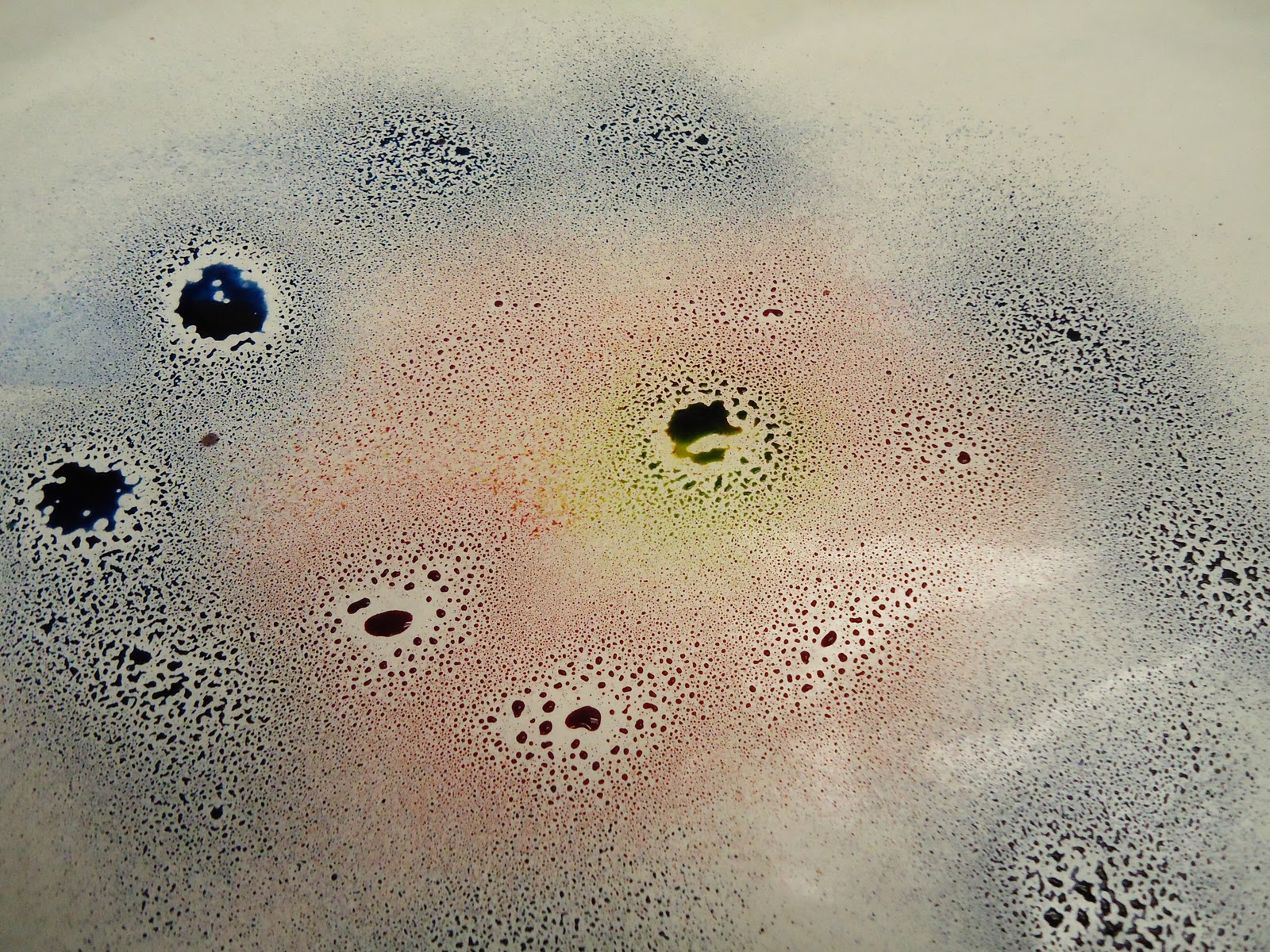
This week I am going to show you a fun and easy staining technique with Tim Holtz's Adirondack Color Wash.  It is a great method for making background papers.  


There are a lot of fun uses for the Color Wash inks.  Today I am just going to show you one of those.  You will need a few things to do this process yourself.  Those supplies are:
  1. Tim Holtz's Adirondack Color Wash
  2. Water color paper
  3. Freezer paper or another non porous work surface
  4. Paper Towels
  5. Windex


Tim Holtz's Adriondack Color Wash

Since this technique involves introducing a lot of moisture to paper you are going to want to choose a paper that can stand up to that.  I like to use watercolor paper.  I used these small post card size that I will later stamp on and layer onto the front of a card.

Before I get started, I cover my work surface with freezer paper, which you can find right in the grocery store.  You'll want to make sure that you have the shiny side up as that will be your palette.  It is the perfect palette because when you are done with your first set of color, you can just wipe it right up and start all over.

After you've covered your surface, choose between 2 and 3 colors to create your design.  Spray them right onto the freezer paper.


I tried this technique with water and it will work.  However, I discovered that the colors really pop if you spray some Windex onto it.  Then it looks like this...


Then you take your paper and press it down into the mixture.  Tap the paper to make sure that the whole surface gets covered.  Don't worry...the curling that occurs is normal.   It will straighten out some as it dries and then pressing it under some heavy books will take it the rest of the way.


Pull it up and lay it into a clean area of your palette.  It is going to drip, so be careful.


Take some paper towel and blot!  Don't rub, just blot it to get the excess water off.


You can get some really pretty marbling using this technique.  And, come on, messy is fun!

I am going to try to post one more time before the weekend...but if not.  Have a happy and healthy holiday!!

Artfully yours,
Theresa


Monday, November 22, 2010

My Favorites Friday: ATCs


Happy Friday! I hope this post finds everyone well and gearing up for a fun and exciting weekend. The weekends always seem to fly by so fast. This week I want to share with you one of my favorite art forms...Artist Trading Cards or more affectionately known as ATCs.


What is an ATC? An Artist Trading Card is similar to Baseball Cards. ATCs are miniature works of art. There is really only one strict rule to creating an ATC...size! All ATCs measure 2.5" x 3.5" in size. After that, you are only limited to your imagination.

The ATC above was created using scrap book paper, dye ink, rubber stamps and a miniature tag. It is a mini collage that incorporates several elements. It has many layers which gives it a texture. You can be as simple or elaborate as you wish.


You can purchase blank ATCs just about anywhere. Dick Blick is a very popular site for purchasing such materials. However, you can use simple playing cards or you can cut your own. I like to use card stock or old post cards...as is used in the sample above. I have even created them out of fabric, but I usually use some type of one sided fusible interfacing to give them a little more stability.


On this ATC I punched the image into the top layer of paper. I used gold pigment ink around the edges and image to make them stand out.


This ATC incorporates a decorative brad and a slide. I don't generally worry about things sticking off the edge of the card. I trim them later by turning the card over and trimming off the excess with an Xacto knife.

What do you do with an ATC? That's simple! You trade them, of course!! There are all sorts of swap groups out there. As a matter of fact, if you belong to any of the groups that are out there you should check to see if there are any for Artist Trading Cards. I bet they do! There is a really cool site called ATCsforAll that has been around for quite a while. They are constantly running swaps. You should really check out all the swaps they ran so far this year! These guys are obviously passionate about ATCs!!

If your interest is piqued...here is another fantastic site with some outstanding eye candy: Art-e-zine Trading Card Swap. This takes place in the UK...which just goes to show you...ATCs are global!

I hope you enjoyed this little preview on Artist Trading Cards. Whether you create these precious gems already or are going to give it a try...feel free to share! I'd love to see what you are creating. Plus, if I get enough feedback, I'd love to post some pictures of other artists' cards.

Artfully yours,
Theresa

Wednesday, November 17, 2010

SIZZIX TRIPLE PLAY BLOG HOP WEEK 3: MY VINTAGE GARDEN


Welcome back! We are now on Week 3 of Sizzix Triple Play Blog Hop. I had so much fun this week playing with the featured die...which was designed by Brenda Pinnick. So go grab a cup of java and settle in...I have lots of pictures this week!

Let's start with a list of supplies:

Other Supplies:
  • 12x24 stretched cotton canvas
  • Sizzix Sizzlets Die Set # 656539 3PK - Flower Layers #3
  • Tim Holtz Distress Ink: antique linen, tea dye, vintage photo, walnut stain
  • Stipple brushes
  • Make-up sponges
  • Small brads: pale yellow, bright yellow, antique brown
  • Mod Podge: paper and fabric
  • Paper piercing tool
  • Folk Art High Definition Visual Texture by Plaid: sunflower, yellow ochre, forest moss, hauser green medium, thicket
  • Textured stamp
  • Vellum
  • Bazzill papers

I started with a blank canvas. It matters not what size you choose. I selected 12 x 24 because I wanted to have a lot of surface on which to add texture. I did not treat the canvas with Gesso or anything else. I left a completely bare surface.


Then using Tim Holtz's Distress Ink in my fav colors, some makeup sponges and stipple brushes I start to distress the surface of the canvas. I stippled and I sponged...and I even went direct to canvas with my pad. If you are not familiar with the process, you simply rub the surface of the ink pad directly onto the surface where you want the color. **IMPORTANT NOTE: Canvas is a textured surface...so be aware that the stamp pad surface can get a little bit chewed up. I have doubles of all my pads, so I have a set just for this purpose.**

When I distress anything I start with the lightest color and work to my darkest. I also start at the edges and work my way in towards the middle. I use my darkest colors towards the edges.


Brenda was very generous with the amount of blooms she supplied and so I took one of the paper bloom and used it as a stencil. I placed the bloom onto the canvas surface and then stippled some tea dye and vintage photo around the edges of the bloom. It created this effect:


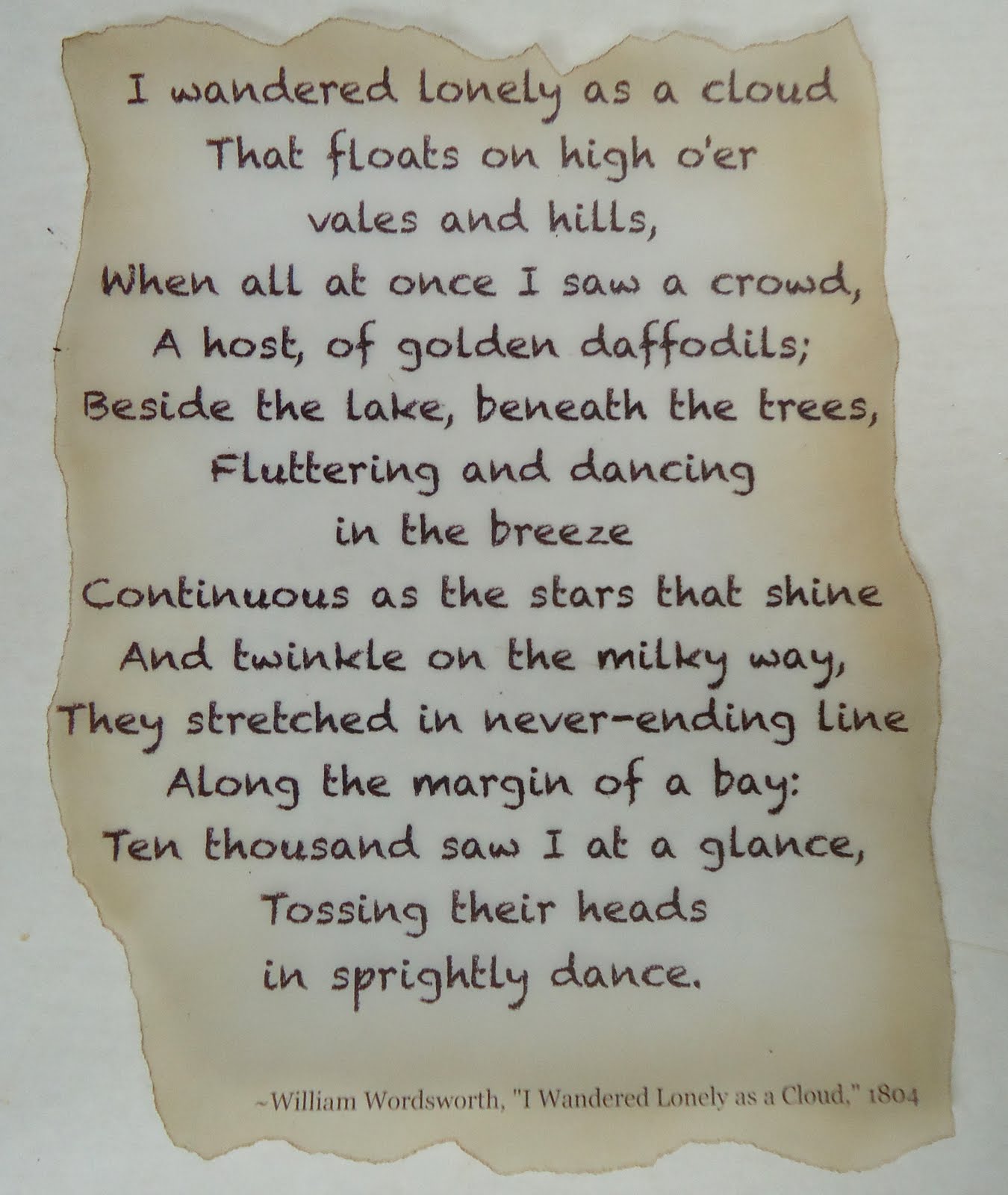
Next, I printed out a poem that I really liked onto vellum. Now I realize the poem refers to daffodils...but I am taking artistic license here! I tore the edges and then I stippled on the BACK side of the vellum one of my lighter color inks, again working from the outside to inside. If you can see in the photo below...I didn't stipple the color over the entire piece of vellum. When you do this technique, the color should be darkest at the edge and gradually lightens as you work towards the middle. Then, I flipped the vellum back to the front and with the next shade darker ink...I stippled just the very edge of the vellum.


Using a very thin coat of Fabric Mod Podge, I adhered the vellum to the canvas. Now don't worry if the vellum resists sticking. What I did is put a book under the canvas, then I placed a piece of wax paper over the vellum and put a couple of heavy books on top of that. I left it for a a while. Once that adhesive is dry, it's on there! **NOTE: always put wax paper or butcher paper between layers that are still wet from glue so that they don't bleed on each other or stick together!


I really love using vellum. Because it is translucent, you can still see the stenciled blooms behind it.


Next, I began to layer the pieces of the blooms together. Brenda sent such a variety that no bloom looks the same! I did stipple some ink onto the paper pieces and some onto the fabrics and felt to mute down the color to go with my vintage theme. Isn't that beautiful!

I cut a few extra blooms with another Sizzix die I had so that I could cover more of my surface and compliment the Brenda's big flower blooms. I altered some of the blooms with the ink and a textured stamp. I assembled the flower layers and pierced the centers with a paper piercer so that I easily slide in the brads.

I used Mod Podge for fabric and for paper to adhere the blooms to the canvas...then I let it dry completely.


Once everything was dry, I started to add some details by doodling some vines and leaves onto the canvas with the Visual Texture by Plaid. I just love that stuff! It adds a lot of dimension. I also added some extra details right onto the flowers!


I was really pleased with how my project came out this week. It is very me! I can't wait to see what everyone else has done...I am sure you feel the same. So, go ahead.....hop forward!

Artfully yours,
Theresa

Wednesday, November 10, 2010

SIZZIX TRIPLE PLAY BLOG HOP WEEK 2: B is for BABY


Hello again! Welcome to Week 2 of the Sizzix Triple Play Blog Hop! This week features Karen Burniston's Twist Cube Die. Lemme tell ya...it is a really fun die to play with because it is interactive. When using the die as originally instructed, it twists and pops up. Very cool effect. I, however, decided to do a little something different with it. Hope you like!

The materials you will first need to get started are:

Sizzix Big Shot cutting machine
Sizzix Accessory - cutting pad, extended
Sizzix Accessory - premium crease pad, extended

Here are some other materials that I used:

ATG Tape Runner
Paper Trimmer
Xacto knife and mat
Family Treasure's Scalloped edged scissors
1/16th" hole punch
PPA
Golden's Fluid Matte Medium
Baby Feet paper, Stemma
Pastel colored card stock, Bazzill
Pale green satin ribbon - 1/8"
Yellow organza ribbon - 3/4"
Plaid's Folk Art Paint in light blue, jamaican sea, lemonade and baby pink
Doodlebug Design Sugar Coating lily white glitter
Stickles
Tissue paper
Candy


Karen and the lovely staff at Sizzix were kind enough to send me a nice neutral color...black. The first thing I did was assemble the box. I am going to be very honest here! I had no idea what I was going to do with it after I'd assembled it. I only knew that I wasn't going to make it pop up. Don't take that the wrong way though. It wasn't that I couldn't think of what to use it for...quite to the contrary! Did I want to make a photo box? Or an ornament? Maybe a bat...because that is what those top pieces remind me of? Get the idea?

As I was looking at it I thought, "that would make a great alphabet block!" However, having only one to play around with....and of course, I'd gone and assembled it already...it occurred to me how cute it would be as a baby block that one could use for a baby shower favor!


So, I worked a little bit backwards. If I hadn't put the cube together first, I probably would have covered the individual pieces with paper first. Since I didn't do that, I had to work a little bit backwards. Now a note to all....if you are going to use your diecut as a pop up, will want to do your assembly with really super strong glue! As I knew my box would be stationary, I used my ATG tape runner to put the actual box together.


I covered the top tabs first. I used PPA to apply the paper to the cube. I have found that once the glue dries, it adds a little stability.


Then I covered the sides also using PPA. I didn't cover the bottom, but of course, if you'd like to on yours that's just fine! I also chose to cut away the part of the tab that looks like a wing.


Next, I used 1/8" pale green ribbon to finish off the top edges of the box. It hid any black sticking out and gave it a cleaner look.


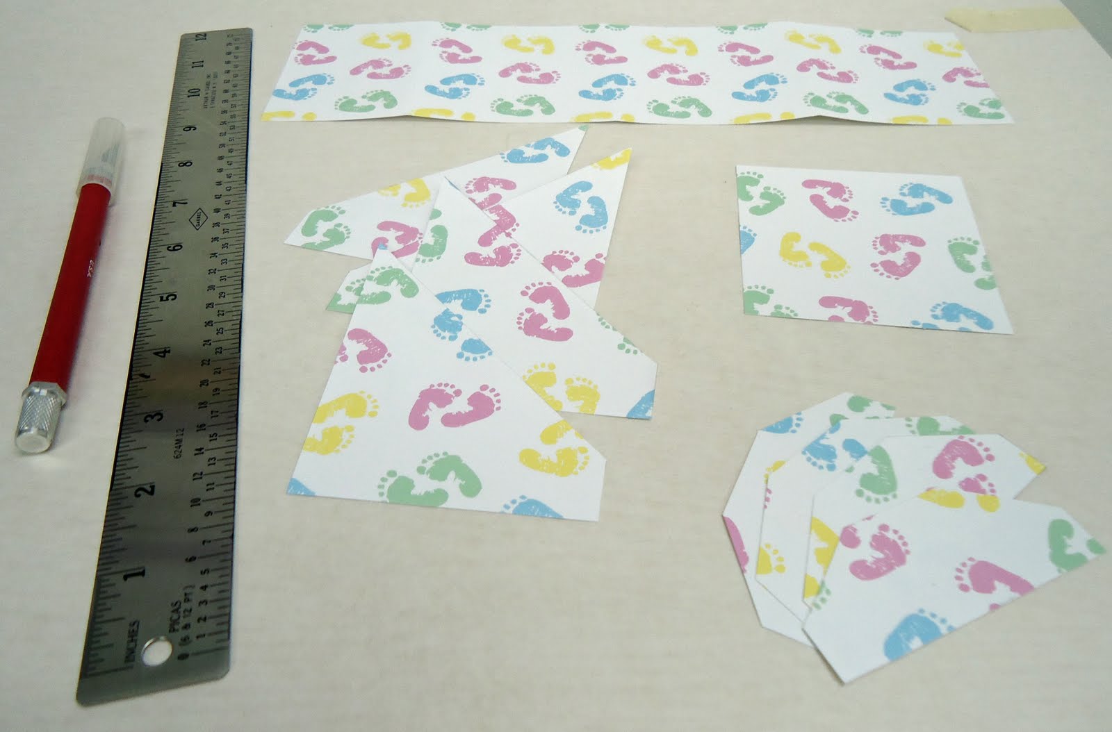
I used my pastel colored solid papers to adhere to the sides of the cube. The first layer I cut 3"x3" and taped them to the sides of the box. I cut another set the same size and trimmed the edges with my Scalloped edged scissor. How did I get that so straight? You can take a look at the technique I used at this past Tuesday's Tips, Tools & Techniques post. I layered the scalloped pieces on top of each square. Plus I made sure to have a different color combination on each side.


I love Stickles! It is glittery and sparkly without the mess. Not that I mind mess, of course, but it is fun and easy and quick to use. Here I applied a little dot of Stickles in the center of each scallop.


Don't those Stickle dots look great? Now my favorite part of the cube is the letters. I used chip board letters that spelled out B A B Y. I painted each letter a different color with acrylic paint and let them dry really well. Then I applied a thin coat of Golden's Fluid Matte Medium to the front of the letters and then dipped those into that Lily White Glitter. It is a super fine glitter and the paint color shows right through it. Love it! Then I glued one letter to the center of each paper panel.


Finally, I punched two tiny holes using my 1/16th" hole punch into the tip of the triangular side tabs. I threaded the organza ribbon through each side and tied a simple knot. The hole is so tiny that the big knot I made will not go through it. Plus the layers of paper, glue and the ribbon lining should keep anything from ripping. I mean, I wouldn't load this thing up with change...but for it's intended purpose here, it is perfect.


I threw in some tissue paper in baby colors to bring it all together. Then I filled my baby favor up with candy. Hmmm...I think I am detecting a theme. I dunno, maybe I'm always hungry when I'm working on these types of projects!


I hope you enjoyed this week's project. I really think it looks so sweet.

Artfully yours,
Theresa

Related Posts Plugin for WordPress, Blogger...