Thursday, December 2, 2010

SIZZIX TRIPLE PLAY BLOG HOP WEEK 5: SUNFLOWER SURPRISE


We've hit it! Week 5 of the Sizzix Triple Play Blog Hop! Can you believe that 5 weeks has gone by already? I sure can't. What's really got me is that there is only 2 weeks left to the blog hop. I have looked forward to each project every week...so I have no idea what I'm going to do after...'cept maybe BEG Eileen, Karen and Brenda to just send me things at random. What do you say ladies? Help a crafty sista out? LOL

So, this week we are featuring another incredible die designed by Karen Burniston. I was particularly excited about this week's project because I am a huge of fan of pop-ups. Yes, that's right people...Karen's die is a pop up! As usual, I couldn't decide on a concept. I only knew that I was definitely using this die as it was intended! No worries...there are pics of that pop up coming up. But first...in case you wanna make one just like this...here is your weekly supply list:

Sizzix products:
Sizzix Bigz XL Die #656740 - Gift Card Holder w/Phrase For You 3-D (Pop up)

Other supplies:
Blank greeting card (no smaller than A-2 size)
Neutral colored cardstock
Yellow cardstocks by Bazzill
Vellum
Stickles in a coordinating color
Distressed Ink by Tim Holtz
Stipple Brushes
Red liner tape
Mod Podge
Foam brush
Xacto knife & cutting mat


I am from the northeast. I love it here...and the change of seasons (although I've been known to whine...cough...about it being too hot or cold at times). The one thing, however, I can absolutely do without is Daylight Savings! Boy, do I hate it when it gets dark at 4:30 in the afternoon. Plus, the weather has been miserable to boot! This is exactly why I was particularly drawn to the bright sunflower pictures that my best friend's daughter (who's 13) took. Plus, sunflowers are my very fav flower!! It really helped cheer me up! Who wouldn't want a blast of warm cheeriness during these winter days with a Dunkin Donuts gift card to pick up a nice hot coffee! I know I'd love to get one of these babies in the mail! (feel free to email me for my snail mail ... he he)

Oh my, it seems I have digressed yet again. My apologies.

Soooooo....I started with a blank, white greeting card. Of course, the first thing I did was grab some ink and my stipple brushes. Yes, I have a thing with those. I just swept some color across those bare white edges...on the front of the card...and on the inside as well. Because I was using these gorgeous, bold yellow sunflowers, I went with Shabby Shutters and Peeled Paint as my Distress Ink accent colors.


I mentioned last week how I love to print photos on vellum because I like the effect. I did the same this week. This particular sunflower I cut out with my Xacto knife. Please be sure that you remember to use a cutting mat. :)

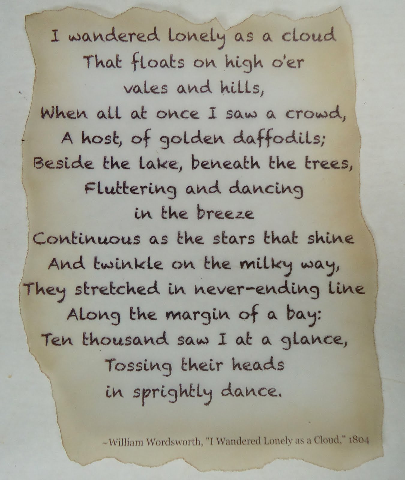
I layered two pieces of yellow card stock, the lighter of the two on top. I lightly brushed some Mod Podge onto the back of the vellum sunflower and layered it down. While that was drying, I went back to my computer and found part of a sunflower poem that I liked a lot, drafted up a saying for the inside of my card and printed those up onto another piece of vellum. I'm fond of vellum, too! I tore around my sayings and brushed on some Distress Ink in Brushed Corduroy. I glued the poem to the front of the card and set the inside saying aside for later.


In the kit that Karen sent, there was a frame type piece that was cut out in white. I glued another one of my sunflower pictures (printed in vellum, naturally) to the front and cut the excess off. This piece inserted perfectly into the pop up. Wait...you'll see!

Next, I was ready to assemble the pop up! Following the directions carefully, I used red liner tape to secure the pop up inside the card. It was very simple and the directions were very well written! Once that was attached, I used double stick tape to attach the extra sunflower framed piece. I only taped across the top of the frame. It is important to note this because if you tape across the bottom, it will stick to the card and prevent the card from opening all the way! That, my friends, would be bad!

I used some Stickles on the "FOR YOU" just to make the letters stand out a little bit more...and, honestly, who doesn't love a little sparkle?

When it was assembled, it looked like this:


Just to finish the card off, I added the light yellow cardstock and glued my vellum saying over that.

Then I added my gift card like this:


This is really just such a special die. You can use it anytime, for any occasion. It is like getting two gifts in one! Can you imagine how special you will make someone feel handing them a gift card in a completely customized card? It's perfect for a teacher's gift for Christmas or end of year...and would make a spectacular vehicle for a personalized birthday present! Sure beats the socks off those cardboard holders that come with the gift card, I say!

I hope my Sunflower Surprise gift card holder has brightened your late fall days! Can't wait to get a start on next week's project which will feature another versatile die from Brenda Pinnick. Time to hop forward....

Artfully yours,
Theresa

Tuesday, November 30, 2010

Tips, Tools and Techniques Tuesday!


Hi everyone! Welcome to a brand new week. I hope you have all recovered from your Turkey induced comas and that you are basking in the glory of your leftovers! Come on now...I know it's Tuesday, but you till have leftover turkey...I know it!

As I promised, I am back to work this week and back on my blog. I'm glad to get back in the swing of things too!


This week I have another really great tool to share with you. These are stipple brushes. A stipple brush is an artistic tool used to add texture or shading. I use them constantly. As a matter of fact, if you have been following the Sizzix Triple Play Blog Hop and seen any of my posts from that, I have used my stipple brushes on the last two projects:

Stipple brushes can be used for a myriad of things. I can add texture by pouncing my brush straight up and down or I can sweep it from the edge of the paper towards the inside to give a project depth. I have made really great back grounds for beach pages and I have used them to antique handmade books and other projects. I have used them with stencils...getting both the positive and negative images.

Mostly, I use my stipple brushes with stamp pads or reinkers. I like the effects I can get. I keep a brush for each color family. You can also use stipple brushes with paints, but you will want to make sure that you wash your brushes thoroughly and let them dry completely after.

If you don't have any, you should really get a couple and play with 'em. It is a lot of fun.

Artfully yours,
Theresa


Thursday, November 25, 2010

SIZZIX TRIPLE PLAY BLOG HOP WEEK 4: SCHOOL DAYS


Happy Turkey Day everyone! Welcome to Week 4 of Sizzix Triple Play Blog Hop. Can you believe we are smack dab in the middle already? Time sure does fly when you're having fun. This week we are using Eileen Hull's Frame and Frame Back with Stand. Let me tell you, there are a lot of elements with this die! There are really so many possibilities. I was really inspired most of all...you're gonna think I'm weird...by the flat back piece. I don't know what screamed out "chalk board!", but it did. I don't pretend to understand these things, I just go with it.

Let's start of with our supplies this week:
Sizzix Scoreboard Pro Die #656835-Frame and Frame Back w/Stand by Eileen Hull

Other supplies I used
Preserve it Frames 15x15 Black Frame Kit
Raven Black Paper by Bazzill
White Paper
Vellum
Polka Dot Paper by Time Flies
B&W Alphabet Paper by Rusty Pickle
Vintage Chalk by Rusty Pickle
Black Soot Distress Ink by Tim Holtz
Crayola Chalk
1/8" stripped ribbon
Mod Podge
Black Chalk Paint by Plaid
Brown Acrylic Paint
Foam Brushes
Sakura Gelly Roll Glitter Pen
Ultra Fine Point Black Sharpie
White Paint Pen
Foam Tape
Double Stick Tape
Sand Paper
Xacto Knife & Mat
Stipple Brush
Flat Wood Strips
Textural Wood Image


You can see for yourself, this die comes with a lot of elements! You can choose to put them together OR you can use them separately as I did. I have saved the elements that I didn't use for another day. Now...as I mentioned...there was just something about that back piece that make me want to make it into a chalkboard...so I did. Who am I to argue with my inner voice?! To be honest, I think I have just been dying to play with Plaid's Chalk Paint for so long and this really lends itself perfectly.

I painted the back piece according to the directions on the Chalk Paint. You really want to do this first because it needs a couple of coats and then needs to cure for 24 hours. Then you can work on other elements. Then I took thin flat wooden strips that I got from Michaels. I used my Xacto to cut them to the desired size, then gave them one light coat of paint. **Just a note - the chalk paint is going to make the mat board curl. Don't worry about it. It will flatten out some on it's own AND if need be you can always straighten it out later.**


In between coats of paint and drying time, I set to work on my layout.


I took a piece of Raven Black Paper by Bazzill and rubbed a piece of white chalk over half of it. I like this effect because the the Bazzill paper has a texture to it. I tore the polka dot paper and with a stipple brush gently brushed Black Soot ink across the edges. I repeated this process with the chalk paper. Finally, I adhered them to each other in this order....


Doesn't that chalk paper look cool!!!! I didn't get a good pic of it, but once I was at this stage, I took a pice of sand paper to the edges of the chalk and polka dot papers.


I took the scalloped edge frame and and taped the B&W Alphabet paper to the front of the frame. With my Xacto I trimmed away the excess paper. The next frame layer that I put underneath, I used my stipple brush again just at the edges.


Now, in between the two frames I sandwiched a photo that I printed on vellum paper and then layered over white. WHY?? I just happen to like the effect. It comes out softer than when printed on photo paper. Oh, I also went into Photoshop and converted my pics to black and white to stay consistent with my theme.


Again, I took some sandpaper to the front frame to distress it some. I assembled all the layers and added the ribbon and the heart (which is one of the elements in Eileen's die!). I stippled some Black Soot on the edges of the heart, used a Black Glitter Sakura Pen to make the stitch marks and a fine tipped Sharpie.


I took the smallest frame and again stippled the edges, but I also took a textured stamp and stamped it all over the front of the frame in the Black Soot. Then I layered the vellum and white paper underneath it. I tied a simple ribbon and used Mod Podge to fix it to the frame.


Now remember that back piece that I painted with the Chalk Paint? Yanno, that stuff really works great?! I was very impressed with how well it works. Anyway, I just used double stick tape to frame the "chalkboard". I drew on the hearts with a white paint pen....but I used CHALK to write "first day of school".


I tied ribbon around one piece of chalk and added a couple more pieces of chalk which I adhered with Mod Podge. I attached all the elements to my page and then set it aside as I waited for the chalk to dry.


I really like how the this page turned out. I wanted to do something special with it, especially because it is so dimensional, so I decided to frame it with a Preserve it Frame kit I had. The plexiglass is actually a cube with a 1/4" inch lip around the perimeter and it us UV coated so that my papers and photos are protected. It enables me to put dimensional pages underneath without having to use such a deep shadow box.

I hope you enjoyed this week's project. I know that I sure enjoyed creating it. Again, Happy Thanksgiving....time to hop!

Artfully yours,
Theresa

Tuesday, November 23, 2010

A Slight Detour...

Hello everyone...and a very Happy Thanksgiving to you all! Today is indeed Tuesday which means it is time for my weekly installment of Tips, Tools and Techniques. However, this week with the holiday, I am going to take a small hiatus. (insert, obligatory "awwww" here!)

With all the holiday goings on, coupled with some pre-holiday deadlines I am under the gun...so to speak. So instead of authoring a post without my whole heart in it, I have decided to take the opportunity to say....HAPPY TURKEY DAY!!...a little early.

Now don't fret too much....because I will still be posting my weekly Sizzix Blog Hop project. Week 4 will post on Thursday...featuring one of Eileen Hull's very cool dies! As always, I'm just excited to get hopping! Then next week will be back to "normal"!

Enjoy your Thanksgiving feasts...whether you are cooking them or not! I am cooking this year...and I'm grateful for that. I really enjoy cooking! YUM....

Artfully yours,
Theresa

Monday, November 22, 2010

My Favorites Friday: ATCs


Happy Friday! I hope this post finds everyone well and gearing up for a fun and exciting weekend. The weekends always seem to fly by so fast. This week I want to share with you one of my favorite art forms...Artist Trading Cards or more affectionately known as ATCs.


What is an ATC? An Artist Trading Card is similar to Baseball Cards. ATCs are miniature works of art. There is really only one strict rule to creating an ATC...size! All ATCs measure 2.5" x 3.5" in size. After that, you are only limited to your imagination.

The ATC above was created using scrap book paper, dye ink, rubber stamps and a miniature tag. It is a mini collage that incorporates several elements. It has many layers which gives it a texture. You can be as simple or elaborate as you wish.


You can purchase blank ATCs just about anywhere. Dick Blick is a very popular site for purchasing such materials. However, you can use simple playing cards or you can cut your own. I like to use card stock or old post cards...as is used in the sample above. I have even created them out of fabric, but I usually use some type of one sided fusible interfacing to give them a little more stability.


On this ATC I punched the image into the top layer of paper. I used gold pigment ink around the edges and image to make them stand out.


This ATC incorporates a decorative brad and a slide. I don't generally worry about things sticking off the edge of the card. I trim them later by turning the card over and trimming off the excess with an Xacto knife.

What do you do with an ATC? That's simple! You trade them, of course!! There are all sorts of swap groups out there. As a matter of fact, if you belong to any of the groups that are out there you should check to see if there are any for Artist Trading Cards. I bet they do! There is a really cool site called ATCsforAll that has been around for quite a while. They are constantly running swaps. You should really check out all the swaps they ran so far this year! These guys are obviously passionate about ATCs!!

If your interest is piqued...here is another fantastic site with some outstanding eye candy: Art-e-zine Trading Card Swap. This takes place in the UK...which just goes to show you...ATCs are global!

I hope you enjoyed this little preview on Artist Trading Cards. Whether you create these precious gems already or are going to give it a try...feel free to share! I'd love to see what you are creating. Plus, if I get enough feedback, I'd love to post some pictures of other artists' cards.

Artfully yours,
Theresa

Wednesday, November 17, 2010

SIZZIX TRIPLE PLAY BLOG HOP WEEK 3: MY VINTAGE GARDEN


Welcome back! We are now on Week 3 of Sizzix Triple Play Blog Hop. I had so much fun this week playing with the featured die...which was designed by Brenda Pinnick. So go grab a cup of java and settle in...I have lots of pictures this week!

Let's start with a list of supplies:

Other Supplies:
  • 12x24 stretched cotton canvas
  • Sizzix Sizzlets Die Set # 656539 3PK - Flower Layers #3
  • Tim Holtz Distress Ink: antique linen, tea dye, vintage photo, walnut stain
  • Stipple brushes
  • Make-up sponges
  • Small brads: pale yellow, bright yellow, antique brown
  • Mod Podge: paper and fabric
  • Paper piercing tool
  • Folk Art High Definition Visual Texture by Plaid: sunflower, yellow ochre, forest moss, hauser green medium, thicket
  • Textured stamp
  • Vellum
  • Bazzill papers

I started with a blank canvas. It matters not what size you choose. I selected 12 x 24 because I wanted to have a lot of surface on which to add texture. I did not treat the canvas with Gesso or anything else. I left a completely bare surface.


Then using Tim Holtz's Distress Ink in my fav colors, some makeup sponges and stipple brushes I start to distress the surface of the canvas. I stippled and I sponged...and I even went direct to canvas with my pad. If you are not familiar with the process, you simply rub the surface of the ink pad directly onto the surface where you want the color. **IMPORTANT NOTE: Canvas is a textured surface...so be aware that the stamp pad surface can get a little bit chewed up. I have doubles of all my pads, so I have a set just for this purpose.**

When I distress anything I start with the lightest color and work to my darkest. I also start at the edges and work my way in towards the middle. I use my darkest colors towards the edges.


Brenda was very generous with the amount of blooms she supplied and so I took one of the paper bloom and used it as a stencil. I placed the bloom onto the canvas surface and then stippled some tea dye and vintage photo around the edges of the bloom. It created this effect:


Next, I printed out a poem that I really liked onto vellum. Now I realize the poem refers to daffodils...but I am taking artistic license here! I tore the edges and then I stippled on the BACK side of the vellum one of my lighter color inks, again working from the outside to inside. If you can see in the photo below...I didn't stipple the color over the entire piece of vellum. When you do this technique, the color should be darkest at the edge and gradually lightens as you work towards the middle. Then, I flipped the vellum back to the front and with the next shade darker ink...I stippled just the very edge of the vellum.


Using a very thin coat of Fabric Mod Podge, I adhered the vellum to the canvas. Now don't worry if the vellum resists sticking. What I did is put a book under the canvas, then I placed a piece of wax paper over the vellum and put a couple of heavy books on top of that. I left it for a a while. Once that adhesive is dry, it's on there! **NOTE: always put wax paper or butcher paper between layers that are still wet from glue so that they don't bleed on each other or stick together!


I really love using vellum. Because it is translucent, you can still see the stenciled blooms behind it.


Next, I began to layer the pieces of the blooms together. Brenda sent such a variety that no bloom looks the same! I did stipple some ink onto the paper pieces and some onto the fabrics and felt to mute down the color to go with my vintage theme. Isn't that beautiful!

I cut a few extra blooms with another Sizzix die I had so that I could cover more of my surface and compliment the Brenda's big flower blooms. I altered some of the blooms with the ink and a textured stamp. I assembled the flower layers and pierced the centers with a paper piercer so that I easily slide in the brads.

I used Mod Podge for fabric and for paper to adhere the blooms to the canvas...then I let it dry completely.


Once everything was dry, I started to add some details by doodling some vines and leaves onto the canvas with the Visual Texture by Plaid. I just love that stuff! It adds a lot of dimension. I also added some extra details right onto the flowers!


I was really pleased with how my project came out this week. It is very me! I can't wait to see what everyone else has done...I am sure you feel the same. So, go ahead.....hop forward!

Artfully yours,
Theresa

Sunday, November 14, 2010

Tips, Tools and Techniques Tuesday!


Happy Tuesday everyone! Welcome to this week's installment of Tips, Tools and Techniques. This week I am going to share with you one of my very favorite and one of my most cool tools!


If you're wondering what in the heck that thing is pictured above...allow me to introduce you! This is a Japanese Push Drill (sometimes referred to as a Screw Punch) and it's purpose is to punch holes. If you don't have one, I cannot recommend it strongly enough. If you are someone who uses a lot of eyelets and brads, this is a must have tool! Now you might be saying to yourself...I already have hole punches, I don't need anymore. Well this, my crafty friends, is different.

With your average hole punches, you are limited. You can only punch a hole as far into the paper as your tool will let you, which isn't very far! Yes, there are long reach punches, but most of them won't reach into the center of a 12x12 piece of card stock. There are those really great eyelet setter kits that you have to use with a hammer, but they are noisy and everything around you shakes while you're banging the tool with your hammer! Which means a few things... first, it really isn't convenient at 2 am (you know you do it!) and second, if you are at a crop, you're table mates will get irritated quickly.

There are several benefits to adding a Japanese Push Drill to your arsenal of tools. A Japanese Push drill:
  • will punch holes anywhere
  • has assorted bits in a variety of hole sizes
  • is easy to use
  • doesn't hurt your hand
  • eliminates the need to own several punches
  • is quiet and not intrusive
  • will punch through a variety of surfaces INCLUDING (but not limited to) paper, fabric and mat board (which really comes in handy if you like to make your own books)
Allow me to give you a really quick demo:


Please....Please....be sure that you have a self healing cutting mat when using this tool. Just as you would use one with an Xacto knife, you need to protect your work surface.


Look carefully at the picture above. Down near the tip of the punch, you'll see that there is a piece that has those sort of ridges. That piece unscrews and loosens so that you can put the bits in and take them out. Once you've put a bit in and tighten it up, you're good to go.

You want to make sure that you place the punch perfectly straight up and down. The punch should be at a 90 degree angle to your work surface. You don't want the punch to be at an angle or what will happen is you will only punch one side of the hole.


Then you want to push straight down. This is all you have to do most of the time. However, if you are punching through thick card stock, mat board or multiple pieces of paper give the punch a twist while it is fully collapsed. This ensures that the punch goes all the way through.


Release the punch and it will fully extend. When you remove it from the paper or whatever you're punching, you will have a nice clean hole.

Japanese Push Drills are not difficult to find in this age of the internet. You can do a Google search or hit eBay. I recommend, however, Talas. Talas is a great resource if you are a book maker or paper artist of any kind.

Artfully yours!
Theresa
Related Posts Plugin for WordPress, Blogger...